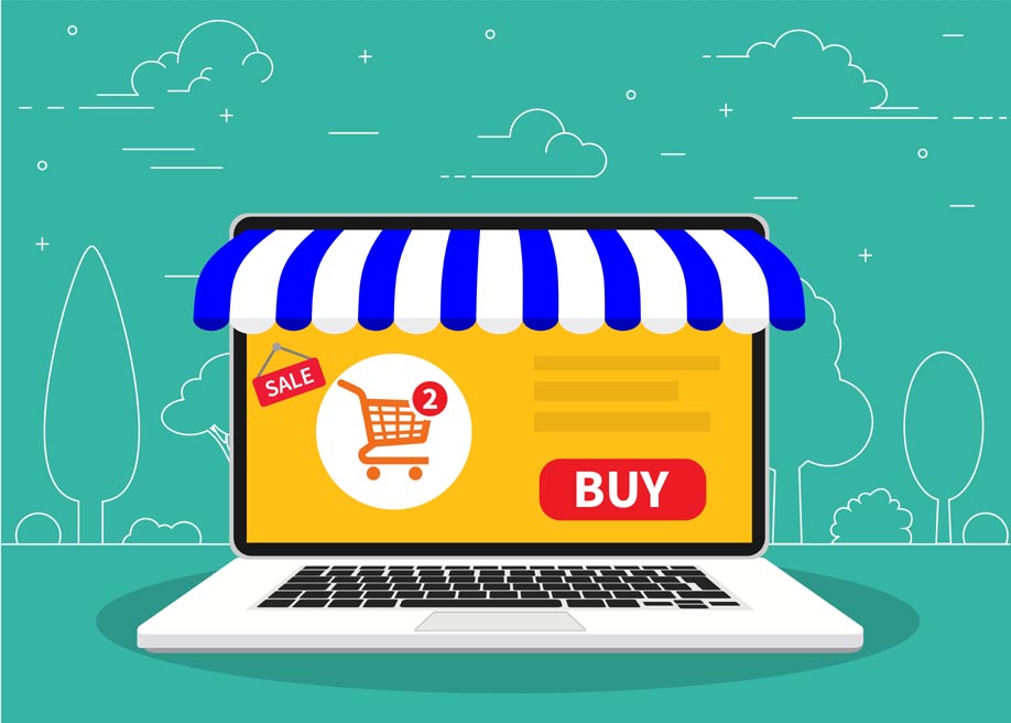

Checkout is the final stage of the purchase funnel on an online ecommerce store. This is the phase when the customer has already decided what they want and is ready to make the final payment. In simple words, this is the phase when ecommerce sellers can expect a guaranteed conversion.
Pretty straightforward, right?
Unfortunately No!
As surprising as this may sound, the majority of shoppers leave the purchase funnel behind and abandon their cart during the final checkout process. To believe statistics, the average shopping cart abandonment rate for ecommerce stores is nearly 74.52%. It means more than half of the ecommerce leads never convert. That’s a big bummer!
The truth is the majority of shoppers abandon their cart due to a poor checkout page. Many ecommerce entrepreneurs don’t understand the significance of the checkout page. So, even after optimizing the product page, running Google ads, and delivering a state-of-the-art shopping experience to customers, they fail to drive the expected conversions.
But, the good news is that you can avoid this scenario by simply optimizing the checkout page and making it more user-centric. In fact, as an ecommerce website development company, we can’t stress enough the importance of optimizing the checkout page of an ecommerce store.
To make your job easier, we have compiled a list of top 10 secrets you can follow to optimize your online store’s checkout page and lower the cart abandonment rate. And, since nearly 500,000 websites use Shopify, we have kept this guide centred on Shopify stores.
So, without wasting another second, let’s get started.
What Does it Mean to Optimize the Shopify Checkout Page?
In simple words, optimizing the checkout page on your Shopify store means eliminating any distractions that would become a barrier for the consumer to complete his purchase.
This could be anything, be it the unnecessary ad pop-ups or lengthy information forms that retailers impose on customers during the checkout process. As we mentioned earlier, checkout is the final stage of the shopping journey and you would not want to commit any mistakes that would cost you valuable customers.
While optimizing a Shopify store, each retailer would have to follow a different approach based on consumer preferences. However, there are a few golden rules that you can implement to make it easier for buyers to complete their transactions and prevent them from abandoning the cart.
10 Easy Ways to Optimize Your Shopify Checkout Page to Drive Better Conversions
1. Add a Business Logo to Maintain a Consistent Color Scheme
To get started with Shopify checkout page customization, we recommend uploading your business logo on the checkout page first. Why? Because adding the brand logo would make things look professional and it’ll become easier to maintain your brand identity all the time.
Not to mention, if you are using the logo across all other pages, uploading it on the checkout page will help you maintain a ‘theme consistency’ throughout the website. Fortunately, adding a logo to a Shopify store is a relatively neat process and anyone can do it within seconds – regardless of the theme you’re choosing.
The challenge would be to decide the right size and dimensions for the logo. Ideally, our expert Shopify web developers recommend using a smaller size (40 pixels) as it’s the supported size for the majority of themes on the store. But, in some cases, you might want to go up to 80 pixels for some themes to make the logo look sleek on both desktop and mobile.
2. Add a Progress Bar to Showcase the Progress of the Checkout Process
By default, Shopify displays the progress bar on the checkout page to help consumers understand how far they’ve come in the checkout process. Unfortunately, this progress bar is so small that the majority of customers are likely to miss it at first glance.
So, after uploading the brand logo, the next step would be to add a clearly visible progress bar so that consumers don’t feel frustrated in the middle of the shopping funnel.
And, instead of placing the progress bar in random places on the page, you would want to place it at the top so that customers instantly know how many steps are remaining in the checkout process.
To make things look more elegant, you would also want to use a similar color scheme for the progress bar as the entire website.
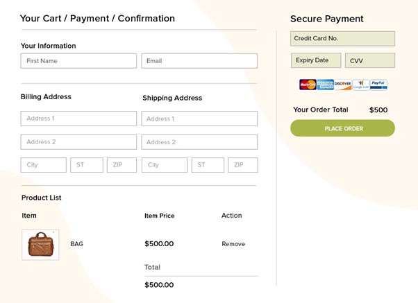
3. Simplify the Checkout Process by Removing Unnecessary Fields
Do you know that 26% of shoppers abandon their shopping cart due to a lengthy checkout process?

The truth is your customers have already gone through a huge hassle to select the right product. They are already feeling frustrated for spending too much time on comparing different items. At last, they want to complete the purchase as soon as possible without having to fill in unnecessary forms.
We understand that as a business owner you want to gather as much customer information as possible. But, if your checkout page has too many fields, you will end up losing valuable sales that’ll automatically result in lower revenue. So, make sure to remove unnecessary fields from the checkout page and keep everything as simple as possible.
To do this, start by thoroughly analyzing the checkout form and evaluate the function of each field individually. If you think any of these fields are remotely unnecessary and might burden the consumers, remove them immediately. Simplifying the checkout form will not only uplift your sales, but it’ll also help you acquire long-term customers for the future.
4. Add a Guest Checkout
Talking about a lengthy checkout process, asking your customers to sign up before they have made the payment can annoy them within seconds. Signing up to any online store is time-consuming and a huge threat to customers’ privacy.
Any new customer is less likely to share their personal information on your website – at least not before they have purchased items multiple times from the store.
So, instead of asking customers to sign up right away, let them place orders using guest logins. For those who don’t know, guest checkouts are a way where customers can place orders without having to share their personal information like email addresses.
And, once they complete the purchase, you can display a pop-up where customers can either decide to sign-up using their social media accounts or skip it for another day. This won’t affect your sales and you’ll still have a chance at getting customers’ personal information.
5. Optimize the Page Loading Speed
The loading speed of the checkout page has a huge impact on your store’s conversions. In fact, the conversions of an e-commerce store drop by 4.42% for every additional second a web page takes to load.
Customers these days have become impatient – they don’t have the time to wait around for several minutes for your checkout page to load completely. So, if you want to keep the cart abandonment rate low, it would be crucial to optimize the loading speed of the checkout page.
To get started, use Google Page Speed Insight tool to analyze the current performance of your checkout page.
Based on the results you get, you can move towards optimizing the loading speed of the checkout page. While there are different ways to optimize the page loading speed, compressing pictures and uninstalling unused plugins is an ideal way to get started.
6. Enable Accelerated Checkouts
Accelerated Checkout (also known as Express Checkout) is a checkout method where you can let returning customers skip the checkout page and directly complete the payment using one of the preferred payment methods.
When you enable express checkout, the fields in the checkout page automatically get filled using the saved information and the consumer can place their order within seconds.
Using accelerated checkouts is a great way to provide your recurring customers with a fully streamlined checkout process. Since they won’t have to enter their personal information again and again, customers will have the power to place an order and get along with their day.
7. Keep Your Pricing Transparent (Avoid Unnecessary Hidden Charges)
For any ecommerce business, transparency is the key to building trust and acquiring long-term customers. This becomes more important when we are talking about product prices.
On your checkout page, you must display a complete breakdown of the entire payable amount so that customers get a clear idea of the actual price of the product and additional charges (taxes, service cost, shipping cost, etc) they have to pay.
Also, if you want to improve the conversions of your online store, it would also be important to display all these charges on the product page itself. Why? Because customers don’t like hidden charges and they are one of the major reasons behind the high cart abandonment rate.
8. Add a ‘Why Choose US’ Section
Despite being the last stage of the sales funnel, sometimes customers might get second thoughts on why they choose your services over other available options after landing on the checkout page.
So, this is a great opportunity for you to list your major USPs and how your services differ from the competitors. Highlight your key competencies in such a way that the customers feel confident to choose your store over others.
Keep in mind that the idea is to highlight your key features briefly. Do not go into detail on how you are the best service provider in the market. Instead, try to keep the points concise, captivating, and as business-centric as possible.
9. Integrate Multi-Payment Support
Not every consumer – who lands on your website – uses Paypal. The sooner you understand this, the easier it’ll become to reduce the cart abandonment rate.
As an ecommerce seller, your job is to provide customers with a seamless shopping experience. And, when your online store only supports a single payment method, a potential customer is most likely to feel annoyed, even if the entire browsing experience had been remarkable for them.
The general thumb rule says that your ecommerce store should allow customers to complete their payments using various payment modes. This is where Shopify is a complete winner. As a retailer, you can easily configure multiple payment modes on your store within a few clicks.
10. Choose a Responsive Theme
Studies reveal that 79% of consumers use their smartphones to shop online. In such a scenario, if your ecommerce shop isn’t optimized for mobile, you are most likely to be missing out on valuable sales.
If you are working alongside professional Shopify developers, they’ll ensure to optimize your store for mobile users. However, if you are executing DIY development, you can choose a responsive theme as it’ll enhance the overall mobile-friendliness of your website.
With a responsive theme, the web pages on your website will automatically adjust their layout according to the screen size users are accessing them on.
Conclusion
So, that concludes our list of top 10 secrets to tweak your Shopify store’s checkout page to lower the cart abandonment rate and uplift the conversions. Regardless of the scale of your online shop, these 10 tricks will help you optimize the checkout page for better sales. In saying that, however, these aren’t the only rules that’ll help you improve your ecommerce sales. As a Shopify seller, you should always keep testing different elements on your website to decide what works with your target audience. In case you need any assistance with Shopify customization, get in touch with our expert Shopify developers and they’ll devise a custom plan to enhance the overall performance of your online store.